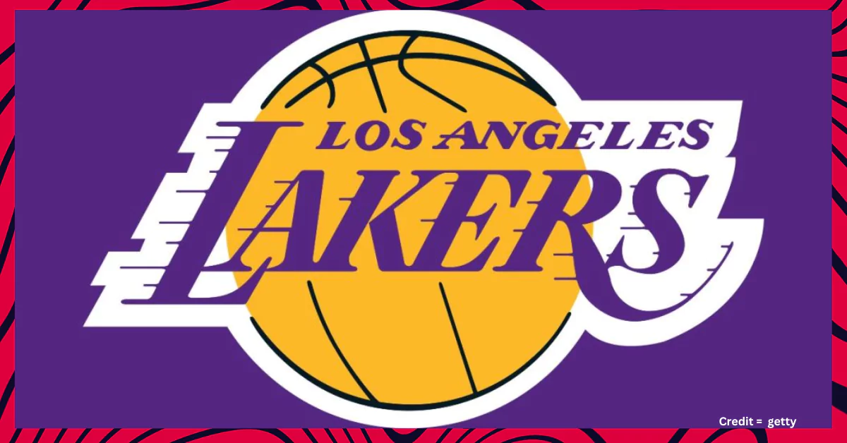
The Los Angeles Lakers logo is more than just a visual representation of a basketball team; it embodies the franchise’s rich history, cultural significance, and commitment to excellence. With its vibrant colours and dynamic design, the logo has become one of the most recognizable symbols in sports.
A Legacy in Design
The current Lakers logo features the words “Los Angeles Lakers” prominently displayed in a bold, italicized serif font over a bright gold basketball. This design has evolved over the years but retains elements that reflect the team’s storied past. The use of purple and gold—colours that have become synonymous with the franchise—was established in the late 1960s and has remained a staple ever since.
Symbolism of Speed and Motion
One of the most striking features of the Lakers logo is the streaks that extend from the lettering. These lines symbolize speed and movement, capturing the fast-paced nature of basketball and the explosive style of play that the Lakers are known for. This design element first appeared in the 1960s and has since become a defining characteristic of the logo, representing not just the players’ agility but also their relentless pursuit of victory.
Historical Evolution
The Lakers’ logo has undergone several transformations since its inception as the Minneapolis Lakers in 1947. The original logo featured a basketball with a map of Minnesota, highlighting the team’s roots before they relocated to Los Angeles in 1960. As they made their transition to California, the logo evolved to reflect their new identity, shedding its geographical ties while embracing a more modern aesthetic.
In 1960, when they became the Los Angeles Lakers, a new emblem was introduced that prominently displayed “Los Angeles” in dark purple over a gold basketball. This marked a significant shift in branding, as it aligned with the vibrant culture of Los Angeles while maintaining continuity with their winning legacy.
Consistency and Recognition
Since its redesign in 2001, the Lakers logo has remained consistent, reinforcing brand recognition among fans worldwide. The combination of purple, gold, and white creates a visually striking palette that stands out both on and off the court. The simplicity yet boldness of the design allows it to be easily identifiable, whether it’s on jerseys, merchandise, or during game broadcasts.
Conclusion
The Los Angeles Lakers logo is not just an emblem; it’s a symbol of pride for fans and players alike. It represents decades of success, resilience, and an unwavering commitment to greatness. As one of the most successful franchises in NBA history, with 17 championships to their name, the logo serves as a reminder of their legacy while inspiring future generations to continue striving for excellence on and off the court. Whether you’re cheering from courtside or donning your favourite Lakers gear from home, every glance at that iconic logo is a nod to a storied past and an exciting future.
Community
For making this list we used the help of Google Trends. You can use various Internet tools to verify this.
Please tell us what you think about this article on What is the meaning of the Lakers logo? If you find any mistake with our article or the post you can comment below. We would love to hear your thoughts and opinions on this topic. Share your perspective by leaving a comment below, and don’t forget to check out some of the related posts for more information about the most followed athletes from different sports on social media.


